Bayesian Linear Regression
Bayesian linear regression builds on the linear regression framework by allowing feature maps and incorporating uncertainty quantification.
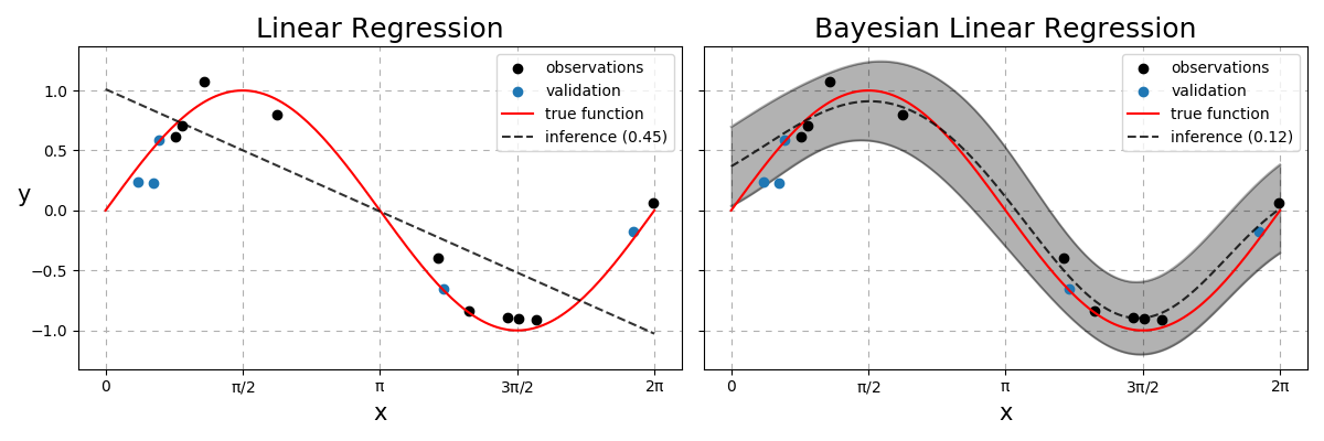
Fig. 23 Linear vs Bayesian Linear Regression. Dashed line represents the model predictions with the number in the legend to be the RMSE between the dashed and red lines. The Bayesian model also quantifies the uncertainties with the grey region being within two standard deviations from the mean.
Projections
Given a dataset \(\mathcal{D}=\{(\mathbf{x}_1,y_1),...,(\mathbf{x}_n,y_n)\}\) where \(\mathbf{X}\in\mathbb{R}^{n,m}\) and \(\mathbf{y}\in\mathbb{R}^n\), the real functional map, \(f^{*}\) is rarely linear. We often prefer non-linear models compared to a linear one when it comes to performance metrics such as the Root Mean-Squared Error (RMSE). This motivates the use of feature projections! How do we choose the function that projects from observation space to this new feature space? Do we need to make assumptions about this feature map? The only guarantee we want is if two data points \(\mathbf{x}_i\) and \(\mathbf{x}_j\) are similar to one another, then we want them to be also similar in the feature space.
One way to guarantee this behaviour is to take a function of how far each one is to some fixed point in the data space. Consider the Radial Basis Function (RBF) defined as
where \(||\cdot||_2\) represents the vector norm (see A2), \(\mathbf{c}\) is a fixed point in \(\mathcal{X}\), and \(l\) is known as the lengthscale. The above function \(\phi\) takes an \(m\) dimensional object and outputs a scalar i.e \(\phi:\mathbb{R}^m \rightarrow \mathbb{R}\). Instead of just comparing how similar our data is relative to a single \(\mathbf{c}\), it is done so to a collection \(\mathbf{C}\in\mathbb{R}^{c,m}\). We define the locations of each vector contained within \(\mathbf{C}\) to be equidistant points in \(\mathcal{X}\) to remove this as an optimisation parameter, but the number of points and their locations can be tuned.
Note
Setting each point of \(\mathbf{C}\) to be each point within \(\mathbf{X}\) is a valid assumption as well but increases computational costs as we collect more data. With further assumptions, this would take us toward a Gaussian Process.
This makes our feature projection
where each element \(\phi_{ij}\) is defined as \(\phi(\mathbf{x}_i;\mathbf{c}_j,l)\) with \(\boldsymbol{\Phi}\in\mathbb{R}^{n,c}\). Assuming that the map from \(\mathcal{X}\rightarrow\mathcal{Y}\) still is of the form
\begin{align} y &= f(\mathbf{x}) + \epsilon,\quad \epsilon\overset{\text{iid}}{\sim}\mathcal{N}(0,\sigma^2),\\ \mathbf{y}|\sigma^2 &\sim \mathcal{N}(f(\mathbf{X}), \sigma^2\mathbf{I}) \end{align}
where \(\epsilon\) is noise present in the data and the functional map \(f\) is now defined as \(f(\mathbf{X}) = \boldsymbol{\Phi}\mathbf{w}\).
Ordinary to Penalised Least Squares
The ordinary least squares solution is obtained by
Generating some data and applying this yields
Python
Data generation and visualisation functions
1 2 3 4 5 6 7 8 9 10 11 12 13 14 15 16 17 18 19 20 21 22 23 24 25 26 27 28 29 30 31 32 33 34 35 36 37 38 39 40 41 42 43 44 45 46 47 48 49 50 51 52 53 54 55 56 57 58 59 60 61 62 63 64 65 66 67 68 69 70 71 72 73 74 75 76 77 78 79 80 81 82 83 84 85 86 87 88 89 90 91 92 93 94 95 96 97 98 99 100 101 102 | from matplotlib import pyplot as plt
from sklearn.model_selection import train_test_split
from scipy.spatial.distance import cdist
import numpy as np
def basis(X1, X2, l = 1.):
""" Radial Basis Function """
D = cdist(X1, X2, metric = 'sqeuclidean') / np.square(l)
return np.exp(-D / 2)
def generator(n, m, k, func, domain = (0, np.pi * 2), scale = 0.15, random_state = None):
"""
Data Generator
Parameters
=================
n : int
Number of training samples to generate.
m : int
Number of dimensions each observation has.
k : int
Number of equidistant points per data dimension.
func : function
True function to learn.
domain : list, tuple
Domain for each dimension of our observations defining the interval [a, b].
scale : float
The standard deviation parameter for the additive Gaussian noise.
random_state : int
Parameter to be used in numpy.random.seed for reproducible results.
"""
# Set seed for X
np.random.seed(random_state)
# Training data
xjs = [np.random.uniform(*domain, size = n) for _ in range(m)]
X = np.array([xj.flatten() for xj in np.meshgrid(*xjs)]).T
t = func(X)
# Set seed for y
np.random.seed(random_state)
y = t + np.random.normal(scale = scale, size = t.shape)
# Centroids
ptp = X.min(), X.max()
cj = [np.linspace(*ptp, k) for _ in range(m)]
C = np.array([c.flatten() for c in np.meshgrid(*cj)]).T
# True function (at x10 resolution)
xj = [np.linspace(*domain, 10 * n) for _ in range(m)]
x = np.array([x.flatten() for x in np.meshgrid(*xj)]).T
t = func(x)
return X, y, C, x, t
def plot_data(ax, X, y, x, t, label = False):
""" Plots training observations and ground truth """
# Labels for legend
labels = ['observations', 'true function'] if label else [None, None]
# Scatter observations and line plot truth
ax.scatter(X, y, c = 'k', zorder = 3, label = labels[0])
ax.plot(x, t, 'r', zorder = 4, label = labels[1])
# Aesthetics
ax.grid(ls = (0, (5, 5)))
ax.set_xticks(np.arange(0, 2.1, 0.5) * np.pi)
ax.set_xticklabels(['$0$', r'$\rm\pi/2$', r'$\rm\pi$', r'$\rm3\pi/2$', r'$\rm2\pi$' ])
ax.set_xlabel(r'$\rmx$')
ax.set_ylabel(r'$\rmy$', rotation = 0)
def plot_inference(ax, x, mu, std = None, n_std = 2, label = None):
""" Plots model predictions with option for uncertainty quantification """
# Mean prediction
ax.plot(x, mu, 'k--', alpha = 0.8, zorder = 5, label = label)
# Uncertainty quantification
if isinstance(std, np.ndarray):
x, mu, std = x.flatten(), mu.flatten(), std.flatten()
ax.fill_between(x, mu + n_std * std, mu - n_std * std, color = 'k', alpha = 0.3)
ax.plot(x, mu + n_std * std, color = 'k', alpha = 0.3)
ax.plot(x, mu - n_std * std, color = 'k', alpha = 0.3)
# Force observations to be first entry in legend
if label and legend:
handles, labels = ax.get_legend_handles_labels()
while labels[-1] in ['observations', 'validation']:
handles.insert(0, handles.pop(-1))
labels .insert(0, labels .pop(-1))
ax.legend(handles, labels, loc = None if isinstance(legend, bool) else legend)
|
Generating and visualising the OLS solution
# 15 observations, each 1 dimension with 8 "c" locations
X, y, C, x, t = generator(15, 1, 8, np.sin, random_state = 2021)

# First 10 are train
X_train       = X[:10]
y_train       = y[:10]

# After 10 are val
X_val         = X[10:]
y_val         = y[10:]

# Generate training and testing phi
Phi_train     = basis(X_train, C)
Phi_val       = basis(X_val, C)
phi           = basis(x, C)

# OLS solution
w             = np.linalg.solve(Phi_train.T @ Phi_train, Phi_train.T @ y_train)

# Visualise using helper functions
fig, ax       = plt.subplots()

plot_data(ax, X_train, y_train, x, t, label = True, val = (X_val, y_val))
plot_inference(ax, x, phi @ w, label = 'ols')
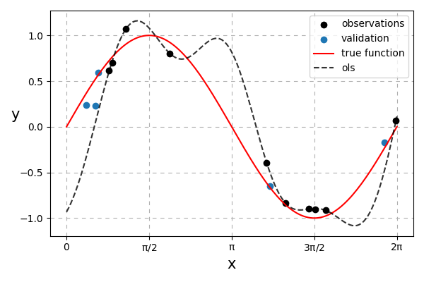
Fig. 24 Ordinary least-squares solution. It can be observed that the solution overfits.
To combat this, we can have a prior preference for simpler \(\mathbf{w}\) values. Values further away from 0 will have erratic predictions whilst values closer to 0 results in a smoother line. To keep the maths simple we can penalise the squared values of \(\mathbf{w}\). This method is known as Penalised Least Squares (PLS) (also known as Ridge Regression).
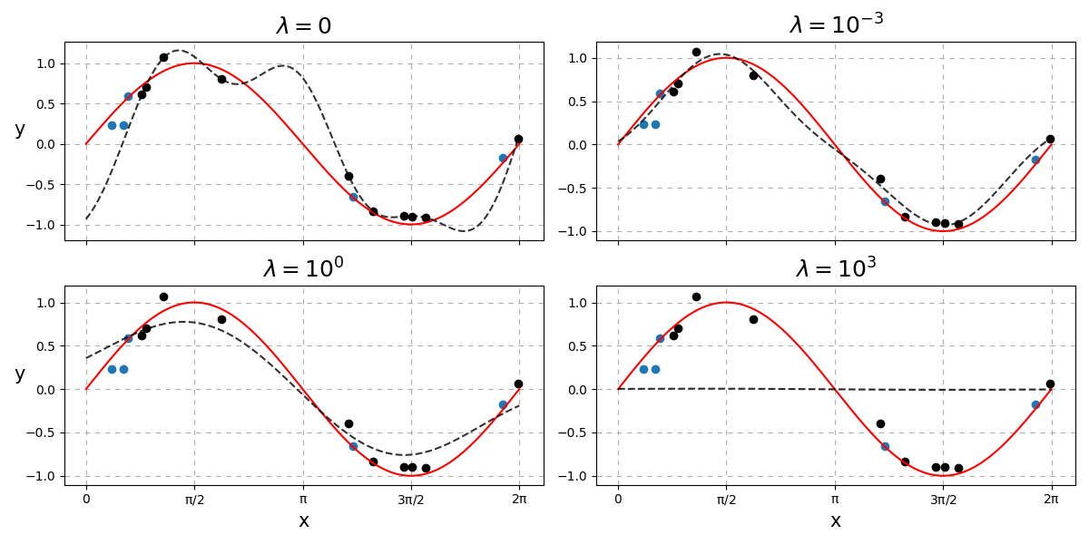
Fig. 25 How \(\lambda\) affects the complexity of the predictions.
As you can see, a low \(\lambda\) results in something similar to the OLS solution. Too high a setting of \(\lambda\) results in a straight line i.e. \(\mathbf{w} = \mathbf{0}\). How do we choose the best \(\lambda\)?
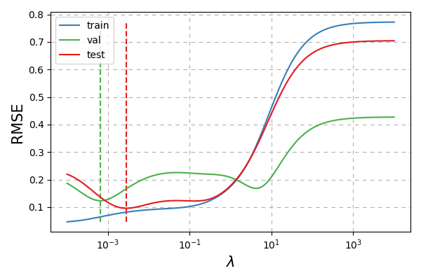
Fig. 26 How \(\lambda\) affects the RMSE. Vertical dashed lines indicate the optimal setting of \(\lambda\) for that respective dataset.
It seems like the best setting of \(\lambda\) according to the validation data is fairly close to the best setting according to the test data.
Bayesian Approach
Lets see if we can do better by first formally defining a prior on our preference of weight values
where \(\alpha\) is the common inverse variance (also known as precision) hyperparameter of the Gaussian distribution. This results in the relation \(\lambda = \alpha\sigma^2\) i.e. the penalty that should be assigned to our weights is the product on how noisy our data is, \(\sigma^2\), and a suitable further penalty based on our prior assumption, \(\alpha\).
The marginal likelihood that we are interested in maximising (if we assume \(\mathbf{C}\) is fixed at equidistant locations and \(r = 1\)) is then given by
We can examine candidate values for \(\alpha\) and \(\sigma^2\) over a grid or use gradient ascent to maximise Eq. \(\eqref{eq:marginal}\). Since both values need to be positive, we can work in log space and exponentiate it to guarantee positive results.
Python
Log marginal likelihood
def log_marginal_likelihood(y, Phi, log_alpha, log_s2):
    n         = len(y)
    alpha, s2 = 10 ** np.array([log_alpha, log_s2])
    common    = Phi @ Phi.T / alpha + s2 * np.eye(n)
    double    = - n * np.log(2 * np.pi) - np.linalg.slogdet(common)[1] - y.T @ np.linalg.inv(common) @ y
    log_p     = np.trace(double)
    log_p    /= 2
    return log_p
Grid search
def grid(Phi, y, log_a, log_s2):
    log_p = np.empty((len(log_a), len(log_s2)))

    for i, la in enumerate(log_a):
        for j, ls2 in enumerate(log_s2):
            log_p[i,j] = log_marginal_likelihood(y, Phi, la, ls2)

    return log_p

# Granularity
m      = 100

# Alpha and noise variance candidate values
log_a  = np.linspace(-3, 1, m)
log_s2 = np.linspace(-3, 1, m)

# Log marginal likelihood
log_p  = grid(Phi_train, y_train, log_a, log_s2)
Visualisation
fig, ax = plt.subplots(1, 2, figsize = (12, 6), sharey = True)

ax[0].pcolor(log_s2, log_a, log_p, cmap = 'magma')
ax[1].pcolor(log_s2, log_a, np.exp(log_p), cmap = 'magma')

ax[0].set_ylabel(r'$\rm \log_{10}\ \alpha$')
ax[0].set_xlabel(r'$\rm \log_{10}\ \sigma^2$')
ax[1].set_xlabel(r'$\rm \log_{10}\ \sigma^2$')

ax[0].set_title(r'$\rm \log\ p(\mathbf{y}|\mathbf{\Phi},\alpha,\sigma^2)$')
ax[1].set_title(r'$\rm  p(\mathbf{y}|\mathbf{\Phi},\alpha,\sigma^2)$')
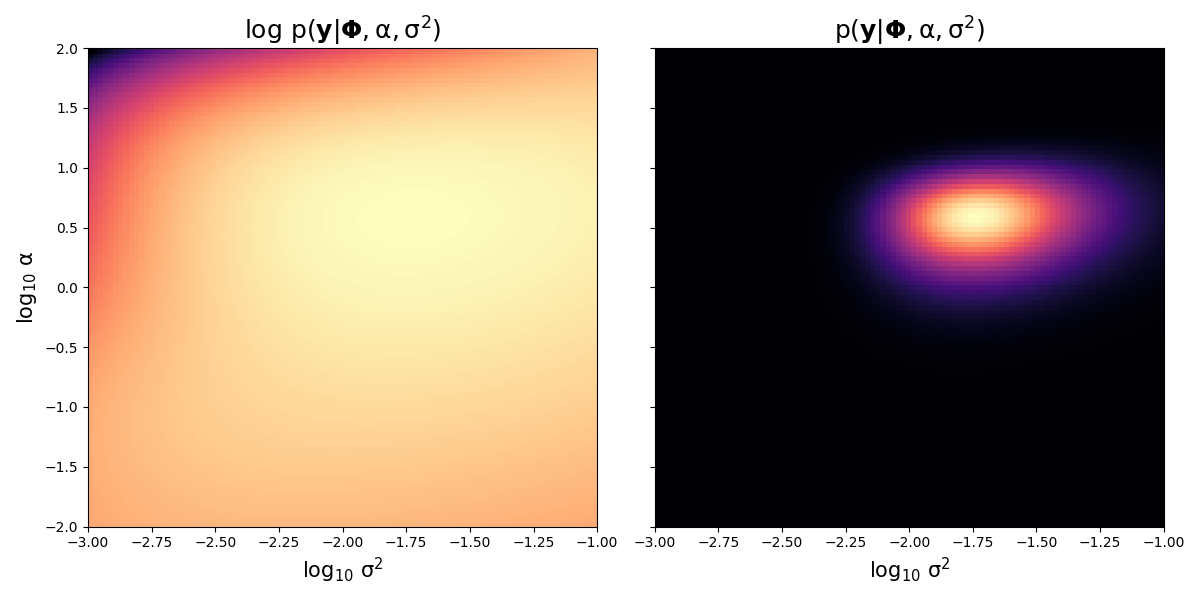
Fig. 27 Marginal and log marginal likelihood values over \(\alpha\) and \(\sigma^2\) values. Brighter colours indicates more probability whilst darker colours indicate lower probability.
Fixing \(\sigma^2\) as the most likely value as indicated in the above graph (around \(10^{-1.75}\)) and varying over \(\alpha\) we have
Python
Fixing alpha and varying lambda visualisation
# Find best (log) alpha and s2 index locations
a_i, s2_i = np.where(log_p == log_p.max())

# Assign best (log) parameters
best_s2   = log_s2[s2_i]
best_a    = log_a[a_i]

# Fix s2 and vary alpha but with same lambda values
log_aa    = log_lam - best_s2

# Compute log marginals varying alpha but fixing s2
log_P     = np.array([log_marginal_likelihood(y_train, Phi_train, la, best_s2) for la in log_aa])

# Visualisations
fig, ax = plt.subplots()

plt.plot(lam, rmses[:,0], c = cmap.colors[1], label = 'train')
plt.plot(lam, rmses[:,1], c = cmap.colors[2], label = 'val')
plt.plot(lam, rmses[:,2], c = cmap.colors[0], label = 'test')

handles, labels = ax.get_legend_handles_labels()

plt.xscale('log')

ix1 = rmses[:,1].argmin()
ix2 = rmses[:,2].argmin()

plt.vlines(lam[ix1], rmses.min(), rmses.max(), color = cmap.colors[2], ls = '--')
plt.vlines(lam[ix2], rmses.min(), rmses.max(), color = cmap.colors[0], ls = '--')

plt.grid(ls = (0, (5, 5)))

plt.ylabel('RMSE')
plt.xlabel('$\lambda$')

# Create twin axis
ax = plt.twinx()

plt.plot(lam, log_P, color = cmap.colors[3], label = 'log marginal')
plt.vlines(lam[log_P.argmax()], log_P.min(), log_P.max(), color = cmap.colors[3], ls = '--')

# Aesthetics
ax.tick_params(axis = 'y', colors = cmap.colors[3])

# Merge both legends
for item, collection in zip(ax.get_legend_handles_labels(), [handles, labels]):
    collection.insert(0, item[0])

plt.ylabel(r'$\rm \log\ p(\mathbf{y}|\mathbf{\Phi},\lambda)$', color = cmap.colors[3])
plt.legend(handles, labels, loc = 4)
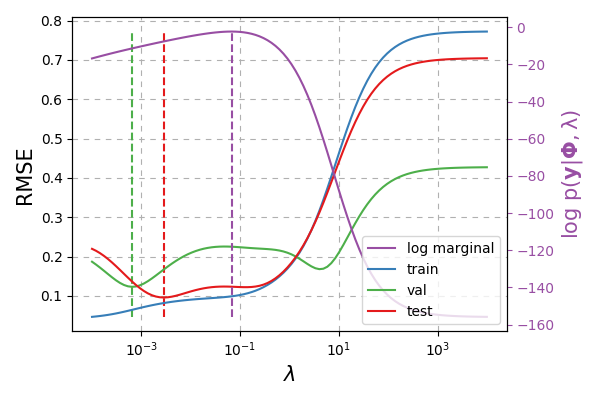
Fig. 28 Green dashed line represents the setting of \(\lambda\) chosen according to the validation data. Red dashed line indicates the true best \(\lambda\). Purple dashed line indicates the best \(\lambda = \alpha\sigma^2\) value chosen according to the training data.
We use the relation \(\lambda = \alpha\sigma^2\) to plot the above where \(\sigma^2\approx 0.01789\) as this was the best \(\sigma^2\) value from Fig. 27. We seem to be getting a similar RMSE value to just cross-validating with the train / validation datasets. The additional gain though is we have uncertainty quantification!
Note
We could actually train on both the training and validation data (as this Bayesian technique does not require a validation set!)
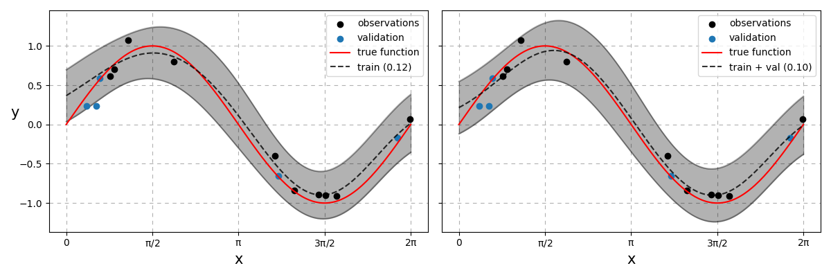
Fig. 29 Bayesian linear regression models. On the left, the model was strictly trained on the training data. On the right, the model was trained on both the training and validation datasets. RMSE values of each model appear in brackets respectively.
Remarks
Both results beats the simple linear model but we still could have done more. There is still room to optimise the lengthscale, \(l\), as well as the locations \(\mathbf{C}\) for generating the basis function. We can search \(l\) additionally in a similar fashion to when we searched over the 2D grid space of \(\alpha\) and \(\sigma^2\) values. \(\mathbf{C}\) cannot be searched in the same manner and so requires all parameters to be tuned via gradient ascent or by MCMC techniques - both will not be covered here. Nonetheless there are still two main unanswered questions here
How many basis functions should we use?
Where should the \(\mathbf{C}\) locations be positioned?